The dataset (au_sumg.e00) can be found at USGS and imported into SQL Server 2008 using Shape2Sql (by Morten). Among other statistics it contains data on known oil reserves (outside the USA, as of 2000).
The simplest query -
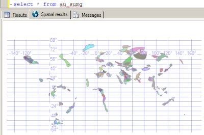
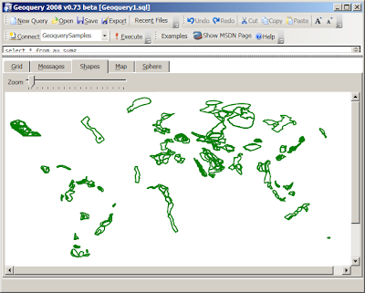
SELECT * FROM au_sumg - looks like this in SQL Server 2008 Management Studio and Geoquery 2008 respectively:

Management Studio's Dundas graphic sure looks nice - but a little difficult to interpret in isolation. Geoquery's Shape tab looks worse without even the funky pastel colors.
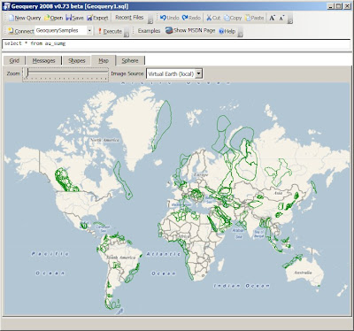
However, the Map tab in Geoquery starts to make up for the green-ness by giving the shapes some context.

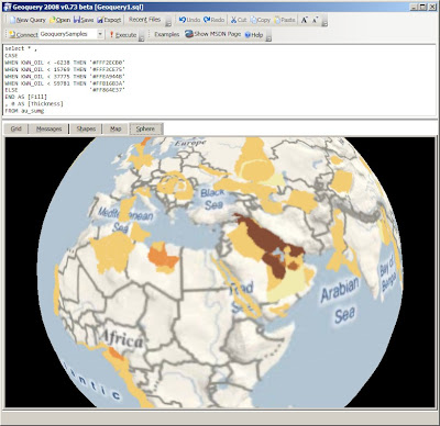
But that's not all - using the same 'scale' as this image and the
[Fill] and [Thickness] 'special columns' that Geoquery supports we can write this:select * ,
CASE
WHEN KWN_OIL < -6238 THEN '#FFF2ECB0'
WHEN KWN_OIL < 15769 THEN '#FFF3CE75'
WHEN KWN_OIL < 37775 THEN '#FFEA944B'
WHEN KWN_OIL < 59781 THEN '#FFB16B3A'
ELSE '#FF864E37'
END AS [Fill]
, 0 AS [Thickness]
FROM au_sumg
Of course, viewing these results on the globe offers absolutely no advantage; but I'll include an obligatory screenshot anyway...

No comments:
Post a Comment
Note: only a member of this blog may post a comment.